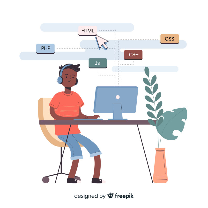
Table of Contents
1. Introduction: Why Responsive Design is Non-Negotiable in 2024
2. The Business Case for Responsive Websites
3. Step-by-Step Planning for Responsive Projects
4. Choosing Your Development Path: Frameworks vs. Custom Code
5. HTML5 Foundations for Flexible Layouts
6. Modern CSS Techniques for Fluid Designs
7. Mastering Flexbox and Grid for Intelligent Layouts
8. Media Queries: Precision Control for Every Device
9. Responsive Media: Images, Videos & Beyond
10. Mobile-First vs. Desktop-First: Which Wins in 2024?
11. Typography That Adapts: Readability Across Screens
12. Navigation Systems That Work Everywhere
13. Performance Optimization: Speed as a Design Feature
14. Comprehensive Testing Strategies
15. Critical Mistakes That Break Responsiveness
16. Essential Tools for Responsive Development
17. Future-Proofing: What’s Next in RWD?
18. Putting It All Together: Your Responsive Checklist
1. Introduction: Why Responsive Design is Non-Negotiable in 2024
Remember the last time you tried to view a desktop-optimized site on your phone? Pinch-zooming, horizontal scrolling, broken layouts – it’s 2024, and users won’t tolerate it.
Responsive Web Design (RWD) isn’t just about fitting content to screens – it’s about creating intuitive, accessible experiences regardless of device. Since Ethan Marcotte coined the term in 2010, RWD has evolved from trend to absolute necessity:
- Mobile dominates: 58% of global traffic comes from handheld devices
- Google prioritizes mobile-friendly sites in rankings
- New devices (foldables, smart TVs, wearables) demand flexible layouts
The Core Principles:
- Fluid Grids – Layouts that scale proportionally
- Flexible Media – Images/videos that adapt without distortion
- Media Queries – CSS that responds to device characteristics
2. The Business Case for Responsive Websites
Why Companies Can’t Afford Non-Responsive Sites
📈 Conversion Impact:
- 57% of users won’t recommend a business with poor mobile design
- Mobile-optimized sites see 30% higher conversion rates
🔍 SEO Consequences:
- Google’s Mobile-First Indexing means your mobile site = ranking factor
- Page experience signals (Core Web Vitals) affect visibility
💰 Cost Efficiency:
- Single codebase = 50-70% cheaper than maintaining separate mobile/desktop sites
- Faster updates across all devices
Real-World Example:
After implementing responsive design, The Boston Globe saw:
- 23% increase in mobile visitors
- 80% reduction in development time for new features
3. Step-by-Step Planning for Responsive Projects
Strategic Planning Phase
1. Define Breakpoints (Based on actual content needs, not just devices):
| Layout Type | Width Range | Considerations |
|---|---|---|
| Compact (Mobile) | < 576px | Stacked content, simplified UI |
| Narrow (Phablet) | 576px – 767px | Begin showing side-by-side elements |
| Medium (Tablet) | 768px – 991px | Multi-column layouts |
| Wide (Desktop) | 992px – 1199px | Full navigation visible |
| Extra Wide | 1200px+ | Edge-to-edge content |
2. Content Prioritization Matrix:
| Priority | Mobile | Tablet | Desktop |
|---|---|---|---|
| Primary | Always visible | Expanded | Full display |
| Secondary | Behind menu | Partial view | Side columns |
| Tertiary | Hidden | Hidden | Visible |
3. Wireframing Tools:
- Figma (Best for collaborative design)
- Adobe XD (Advanced prototyping)
- Balsamiq (Quick low-fidelity sketches)
4. Choosing Your Development Path
Framework vs. Custom Code Decision Tree
Option 1: CSS Frameworks (Bootstrap/Tailwind)
✅ Pros:
- Rapid development
- Built-in responsive grid systems
- Extensive component libraries
❌ Cons:
- Generic look if not customized
- Unused CSS bloat
Option 2: Custom CSS/HTML
✅ Pros:
- Pixel-perfect control
- Minimal code footprint
❌ Cons:
- Steeper learning curve
- More time-intensive
Option 3: No-Code Builders (Webflow/Squarespace)
✅ Pros:
- No coding required
- Built-in responsiveness
❌ Cons:
- Limited customization
- Vendor lock-in
Expert Recommendation:
“For most projects, start with Bootstrap’s grid system, then layer custom CSS for unique components. This balances speed with flexibility.” – Sarah Chen, Lead Developer at PixelForge

5. HTML5 Foundations for Flexible Layouts
The Responsive HTML Blueprint
html
Copy
Download
Run
<!DOCTYPE html>
<html lang="en">
<head>
    <!-- Critical meta tags -->
    <meta charset="UTF-8">
    <meta name="viewport" content="width=device-width, initial-scale=1.0">
    <meta name="HandheldFriendly" content="true">

    <!-- Responsive favicon -->
    <link rel="icon" href="favicon.ico" sizes="any">
    <link rel="icon" href="icon.svg" type="image/svg+xml">

    <title>Adaptive Site</title>
</head>
<body>
    <header role="banner">...</header>
    <main role="main">...</main>
    <aside role="complementary">...</aside>
    <footer role="contentinfo">...</footer>
</body>
</html>
Key Elements:
- Viewport Meta Tag: The cornerstone of mobile responsiveness
- Semantic HTML5: Improves accessibility and SEO
- Landmark Roles: Helps assistive technologies navigate
6. Modern CSS Techniques for Fluid Designs
Fluid Units Deep Dive
| Unit | Use Case | Example |
|---|---|---|
vw/vh | Full-viewport elements | width: 100vw |
% | Container-relative sizing | width: 80% |
rem | Scalable typography | font-size: 1.25rem |
ch | Optimal line lengths | max-width: 65ch |
Advanced Technique: CSS Lock
css
Copy
Download
/* Scales between 16px (320px screen) and 24px (1200px screen) */
:root {
    font-size: calc(16px + (24 - 16) * ((100vw - 320px) / (1200 - 320)));
}
7. Mastering Flexbox and Grid
Flexbox Use Cases
✅ Navigation bars
✅ Card layouts
✅ Vertical centering
css
Copy
Download
.navbar {
    display: flex;
    justify-content: space-between;
    align-items: center;
    flex-wrap: wrap; /* Critical for mobile */
}
CSS Grid Power Moves
✅ Magazine-style layouts
✅ Responsive galleries
✅ Asymmetrical designs
css
Copy
Download
.gallery {
    display: grid;
    grid-template-columns: repeat(auto-fit, minmax(250px, 1fr));
    gap: 1.5rem;
}
8. Media Queries: Beyond Basic Breakpoints
Advanced Query Techniques
1. Resolution Detection
css
Copy
Download
@media (-webkit-min-device-pixel-ratio: 2), (min-resolution: 192dpi) {
    /* HiDPI styles */
}
2. Orientation Control
css
Copy
Download
@media (orientation: portrait) {
    /* Vertical layouts */
}
3. Combining Conditions
css
Copy
Download
@media (min-width: 768px) and (max-width: 1024px) and (orientation: landscape) {
    /* iPad Pro landscape specific */
}
9. Responsive Media: The Complete Solution
Modern Image Handling
HTML5 Picture Element
html
Copy
Download
Run
<picture>
    <source media="(min-width: 1200px)" srcset="hero-xl.webp">
    <source media="(min-width: 768px)" srcset="hero-md.webp">
    <img src="hero-sm.webp" alt="..." loading="lazy">
</picture>
Video Adaptation
css
Copy
Download
video {
    width: 100%;
    height: auto;
    max-height: 90vh;
}
10. Mobile-First vs. Desktop-First in 2024
The Case for Mobile-First
- Forces content prioritization
- Better performance (less overriding styles)
- Aligns with Google’s indexing
When Desktop-First Makes Sense
- Data-heavy enterprise applications
- Legacy system migrations
- Kiosk/display-oriented projects
Industry Data:
- 92% of new projects adopt mobile-first (2024 Web Almanac)
- Mobile-first sites load 2.5x faster on handheld devices
11. Responsive Typography That Engages
Fluid Type with clamp()
css
Copy
Download
h1 {
    font-size: clamp(1.75rem, 4vw + 1rem, 3rem);
    line-height: clamp(2rem, 5vw + 1rem, 3.5rem);
}
Readability Rules:
- Mobile: 16px minimum body text
- Line height: 1.5-1.6 for paragraphs
- Contrast ratio: 4.5:1 minimum
12. Navigation That Works Everywhere
Progressive Disclosure Patterns
Hamburger Menu (Mobile)
html
Copy
Download
Run
<button aria-expanded="false" aria-controls="mobile-menu">
    <span class="sr-only">Menu</span>
    ☰
</button>
<nav id="mobile-menu" hidden>...</nav>
Mega Menu (Desktop)
css
Copy
Download
@media (min-width: 992px) {
    .mega-menu {
        display: grid;
        grid-template-columns: repeat(4, 1fr);
    }
}
13. Performance Optimization
Mobile Speed Checklist
✔ Critical CSS in <head>
✔ Lazy load non-essential media
✔ WebP/AVIF image formats
✔ Font subsetting for typography
Tools:
- Google PageSpeed Insights
- WebPageTest
- Lighthouse CI
14. Comprehensive Testing Strategies
Real Device Testing Matrix
| Device Type | Testing Focus |
|---|---|
| iPhone 15/Android 14 | Touch targets, Safari/Chrome rendering |
| iPad Pro | Pointer vs touch interactions |
| Foldable (Galaxy Z) | Screen adaptation at different folds |
| Desktop + 4K | High-DPI assets, large viewports |
Emulator Limitations:
- Doesn’t replicate real touch latency
- Misses device-specific rendering quirks
15. Critical Mistakes to Avoid
🚫 Fixed-Width Containers
Instead: Use max-width: 100%
🚫 Ignoring Touch Targets
Solution: Minimum 48×48px interactive elements
🚫 Heavy Desktop Elements on Mobile
Fix: Conditional loading with IntersectionObserver
16. Essential Developer Tools
1. Chrome DevTools
- Device toolbar
- CSS overview
- Performance audits
2. Responsive Design Checkers
- BrowserStack
- LambdaTest
3. CSS Preprocessors
- Sass for maintainable responsive code
17. Future-Proofing Your Designs
Emerging Standards
Container Queries
css
Copy
Download
.card {
    container-type: inline-size;
}

@container (min-width: 400px) {
    .card {
        display: flex;
    }
}
Dynamic Viewport Units
dvh(dynamic viewport height)svh(smallest viewport height)
18. Your Responsive Action Plan
✅ Audit existing sites with Lighthouse
✅ Prototype mobile-first in Figma
✅ Implement modern CSS (Grid + Flexbox)
✅ Test on real devices monthly
Final Thought:
“Responsive design isn’t a feature – it’s the foundation of modern web experiences. Master these techniques, and you’ll build sites that not only look great today but adapt gracefully to tomorrow’s devices.”
Now go build something that works everywhere! 🌍💻📱